
Wall Art Colour Psychology — How Colours on Your Walls Quietly Shape Your Mood
The colours in your wall art change how a room feels — cool blues and greens calm the nervous system, warm reds and yellows raise energy and appetite, and neutral creams and blacks read as focus and sophistication. Pick the colour, then pick the print.
This guide is the version we wished existed when we started Rustic Charm: a working playbook for choosing wall art colour the way an interior designer would, but written for an Indian flat or villa, not a Pinterest mood board from California. Most colour-psychology articles online either copy a Sherwin-Williams paint chart from 2014 or hand-wave that "blue is calm" without telling you which blue, what kind of canvas painting, in which room. We will be specific.
We will also stay honest. Colour does influence mood — but the effect is real only when the rest of the room agrees with it. A pale blue painting will not fix a bedroom lit by harsh white tubelights, and a fiery red abstract will not save a living room with a south-facing wall already washed in afternoon glare. Treat your wall art as the last 10% of the colour story, not the first 80%.
The Quick Map: Six Colour Families and What They Do
| Colour family | Mood signal | Best rooms | Pair with |
|---|---|---|---|
| Cool blues | Lowered heart rate, slower breathing, sleep | Bedroom, study, meditation corner | Cream walls, warm wood |
| Cool greens | Restoration, focus, the "biophilic" calm | Living room, study, balcony, work-from-home | White, terracotta, rattan |
| Warm pinks & soft reds | Romance, joy, social warmth | Living room, dining room, foyer | Cream, beige, brushed gold |
| Bright yellows & oranges | Energy, appetite, conversation | Kitchen, dining, breakfast nook | White, blue accents, terracotta |
| Earth neutrals & muted neutrals | Grounding, sophistication, "quiet luxury" | Hallway, formal living, master bedroom | Almost anything |
| High-contrast black & white | Modern focus, precision, ambition | Home office, study, corridors | Wood floors, brass, plants |
The point of a table like this is not to be a rule book. It is to give you a shortlist. Once you know which family of colour your room is asking for, you can stop staring at 4,000 search results and start picking the one canvas painting that fits.
Cool Tones — Blue, Green, Lavender (and Why Bedrooms Love Them)
Cool tones come up in the same conversation again and again on Reddit threads about bedroom anxiety, racing thoughts and bad sleep — and the consensus among interior decorators and a 2020 sleep-environment review by Sleep Foundation lines up: cool, low-saturation colours in the visual field at the end of the day are correlated with lower self-reported alertness and faster sleep onset. Translation for our purposes: a soft purple or muted green canvas above the bed earns its keep.
A 2023 r/interiordecorating thread on bedroom colour put it cleanly: "Cool tones — blues, greens, grays — lower heart rate and blood pressure. They are the dimmer switch for your brain at the end of the day." That is folk wisdom, but the underlying claim shows up in the Pantone Color Institute's mood research too: short-wavelength cool colours reduce arousal in evening lighting more reliably than long-wavelength warm ones.
For an Indian bedroom — usually shared, often with overhead tubelights and at least one east or west window throwing harsh midday light — a cool floral canvas is the safer choice than a deeply saturated abstract. You want a piece that softens the room, not one that demands attention every time you walk past.
View Lavender Field Canvas on Rustic Charm → from ₹1,899
A purple-lavender field reads as cool even though it is technically a warm-cool mix; lavender is one of the few colours that reliably scores "calming" across both Indian and Western mood-association studies (notably Adams & Osgood, 1973, the cross-cultural colour-affect study still cited today). Hung above a bed with cream walls it disappears into the room and supports it; hung in a north-facing room with cool light it gets a touch more grey and even more restful.
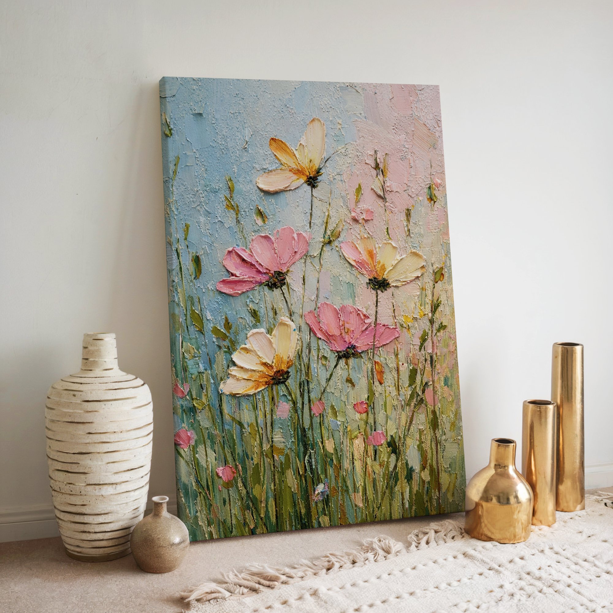
View Pink Wildflower Canvas on Rustic Charm → from ₹1,899
If lavender is too floral-feminine for your taste, a pastel pink-on-green wildflower meadow gives you the same biophilic calm with a different palette. Soft pinks at low saturation behave like neutrals — they are not "warm energising pinks", they are dawn-light pinks, and the brain reads them as the start of a day, not the middle of it.
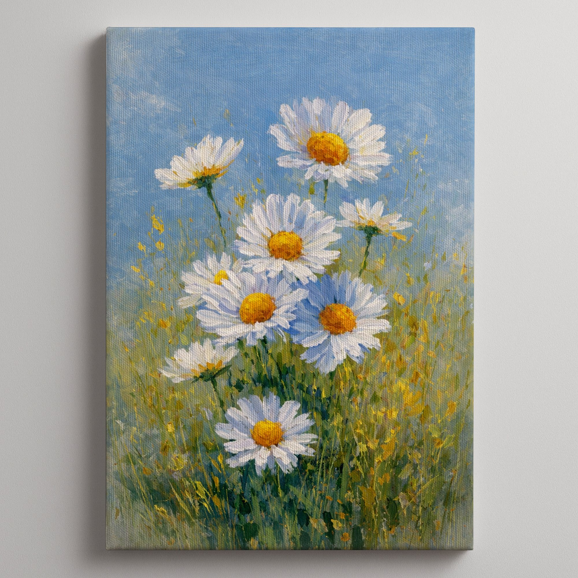
View Daisy Flower Canvas on Rustic Charm → from ₹1,899
For the most clinical-clean version of "calm" — a daisy on a near-white ground — you get the cool-tone benefit without any colour commitment at all. This is the canvas painting we recommend for any bedroom where one partner wants colour and the other wants none. Daisies are a compromise everyone has historically agreed to.
Warm Tones — Pink, Red, Orange, Yellow (and Why Living Rooms Need Them)
Warm tones do the opposite of cool tones — they raise alertness, encourage conversation and (for reds and oranges specifically) increase appetite. A 2014 Journal of Hospitality and Tourism Research study on restaurant interiors found that warm-coloured dining rooms led to longer meal durations and higher reported social engagement. Indian families who routinely host on weekends understand this intuitively — every nani's living room you remember as warm and welcoming had warm-coloured cushions, warm wood, and warm-toned art.
The mistake people make is assuming "warm" means "loud." A pink or peach floral canvas painting is a warm-tone piece; so is a dusty rose abstract, a Mediterranean citrus still life, or a simple sunset photograph. None of them have to be saturated red. In an Indian flat with limited wall space, low-saturation warm tones are usually the right pick — they nudge a living room toward "comfortable host" without tipping into "Diwali sale catalogue."
View Pink Peony Canvas on Rustic Charm → from ₹1,899
The peony is colour psychology's perfect ambassador. It is warm enough to make a beige sofa feel deliberate, soft enough not to fight a patterned rug, and culturally non-specific enough to work in a Bengaluru flat or a Kochi villa. We sell more of these to first-time art buyers than any other product, and the most common feedback is some version of "the room feels finished now." That is exactly what warm-tone art is supposed to do — finish a room emotionally, not just visually.
View Rose Garden Canvas on Rustic Charm → from ₹1,899
If you want the same warm feeling at a slightly more grown-up tone, a Rose Garden in impressionist style does the same job with a touch more sophistication. Impressionist florals get bonus points in colour psychology because the soft edges matter — sharp-edged compositions read as more alerting than blurred ones (a finding from Bar & Neta, 2006, on visual sharpness and threat perception). For a south-facing living room that already gets a lot of warm Indian afternoon light, a soft-edged warm-toned canvas is the right combination.
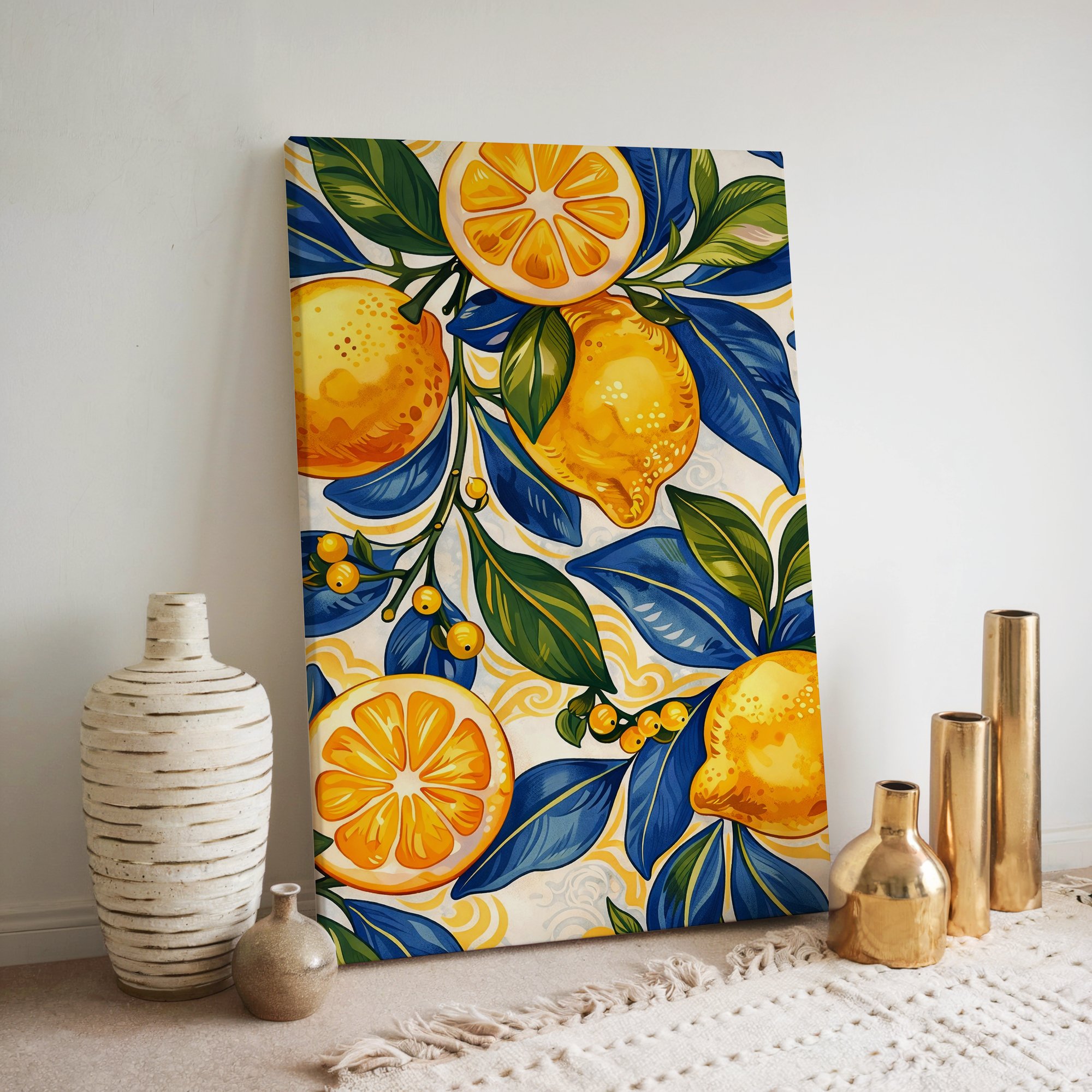
View Lemon Kitchen Canvas on Rustic Charm → from ₹1,899
For the kitchen and breakfast nook, the rules shift. Yellow is the colour psychologists are most cautious about — too much of it triggers irritability, and bright pure yellow is the colour most linked to babies crying in nursery research from the 1990s. But Mediterranean lemon-yellow (a slightly green-shifted, warm-mustard yellow) is the friendly version, and a citrus-themed canvas painting placed where you make morning chai does measurable work on energy and appetite. We picked this lemon palette specifically because it falls on the "appetising" side of yellow, not the "fluorescent classroom" side.
Neutrals and High-Contrast — Where Focus Lives
Pure neutrals — cream, taupe, off-white, charcoal — and high-contrast black-and-white compositions are the colour palette of focus. There is a reason every well-designed library, Apple store and minimalist Scandinavian flat photo on Pinterest defaults to this palette: it removes colour-driven distraction from the visual field, freeing your attention for whatever else is in the room (a book, a screen, a conversation).
In Indian homes, where colour usually runs high in everything from saris to upholstery to spice tins, a neutral or monochrome wall art piece can be the strongest possible statement. It says "this room is for working" or "this room is for thinking" in a way no amount of "Hustle Hard" wall stickers ever can.
View Black White Abstract Office Set on Rustic Charm → from ₹4,999
For a home office, study or work-from-home corner, a high-contrast black-and-white set is the highest-conviction recommendation we make. A study from the Journal of Environmental Psychology in 2018 found that visually busy rooms reduce sustained-attention task performance by 12–18% versus visually calm rooms; the cleanest way to make a room "visually calm" without redesigning it is to swap loud art for monochrome. Black on white reads as decisive, ambitious, and (politely) expensive.
View Abstract Minimalist Set on Rustic Charm → from ₹4,999
If a black-and-white set feels too severe for your living room, an abstract minimalist Scandinavian set gives you the focus benefits with a softer entry point. Cream-on-cream and warm-grey-on-cream work especially well in formal living rooms where the goal is "luxury restraint" — the wall art establishes mood without competing with the rug, sofa, or coffee-table books.
When You Want a Statement — Bold and High-Saturation
Sometimes the right colour psychology answer is more. A bold high-saturation abstract is the colour equivalent of an espresso shot for a room — it concentrates attention, it raises energy, and it creates an unmistakable focal point. If your living room has only one feature wall and you want guests to walk in and know the room has a personality, this is the category to shop.
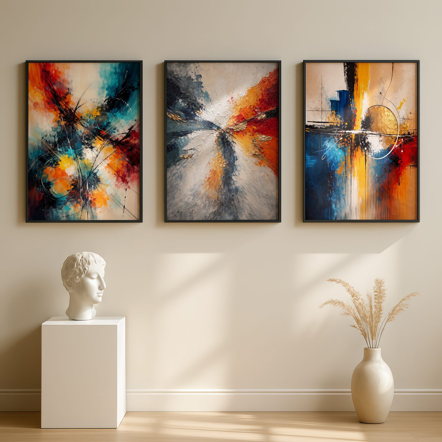
View Bold Abstract Expressionist Set on Rustic Charm → from ₹4,999
The risk with bold colour is fatigue — the brain habituates to a stimulus the longer it sees it (basic neuroscience: Helmholtz, 1867). A vibrant abstract over your sofa is exciting in week one and invisible by week eight. The fix is placement: hang bold pieces where you walk past them rather than where you sit and stare at them. A vivid expressionist set in a hallway, a stairwell, or a foyer does its colour-psychology work every time you arrive home and never burns out.
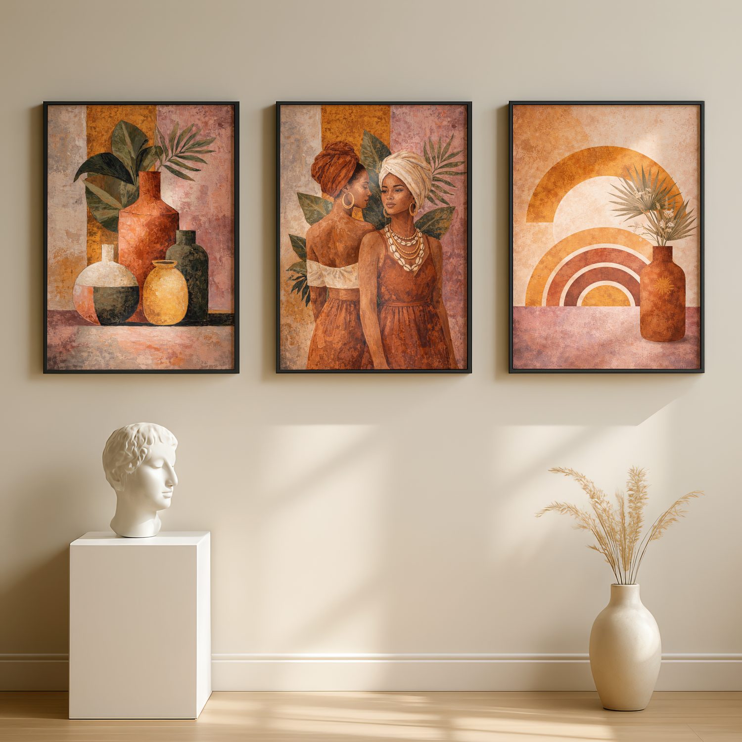
View Boho African Canvas Set on Rustic Charm → from ₹4,999
Earthy boldness is its own category and an underrated answer for Indian homes. African-inspired ethnic boho art carries strong terracotta-and-cream contrast that reads as warm-bold rather than the cooler vibrancy of pure abstraction. In a room with brown leather, terracotta tiles, or warm Indian wood, this kind of canvas painting integrates faster than a "modern" bold set ever could. It is colour psychology the way our grandmothers practised it — tone over hue, warmth over brightness.
Indian Cultural Colour — The Layer Western Articles Skip
Almost every wall-art-colour-psychology article online ignores India, and that gap is the only reason we are writing this. Western colour theory says white is purity, but in India white is also the colour of mourning. Western theory says red is danger; in India red is auspicious — it is bridal, it is wedding, it is Lakshmi. Yellow is happiness in both, but in India yellow specifically signals knowledge and is sacred to Saraswati. Saffron is renunciation; green is paradise and Islam; blue belongs to Vishnu and Krishna; purple is royal but also a relatively recent import; black is protective against the drishti (evil eye), not just sophisticated.
This matters for two reasons. First, you cannot pick a wall art colour for an Indian home using only a Western mood chart — you will end up with a piece that reads "calm" in Pinterest captions and "funeral" to your mother-in-law. Second, the right culturally-resonant colour-symbol can do double duty: it sets the mood and it carries meaning.
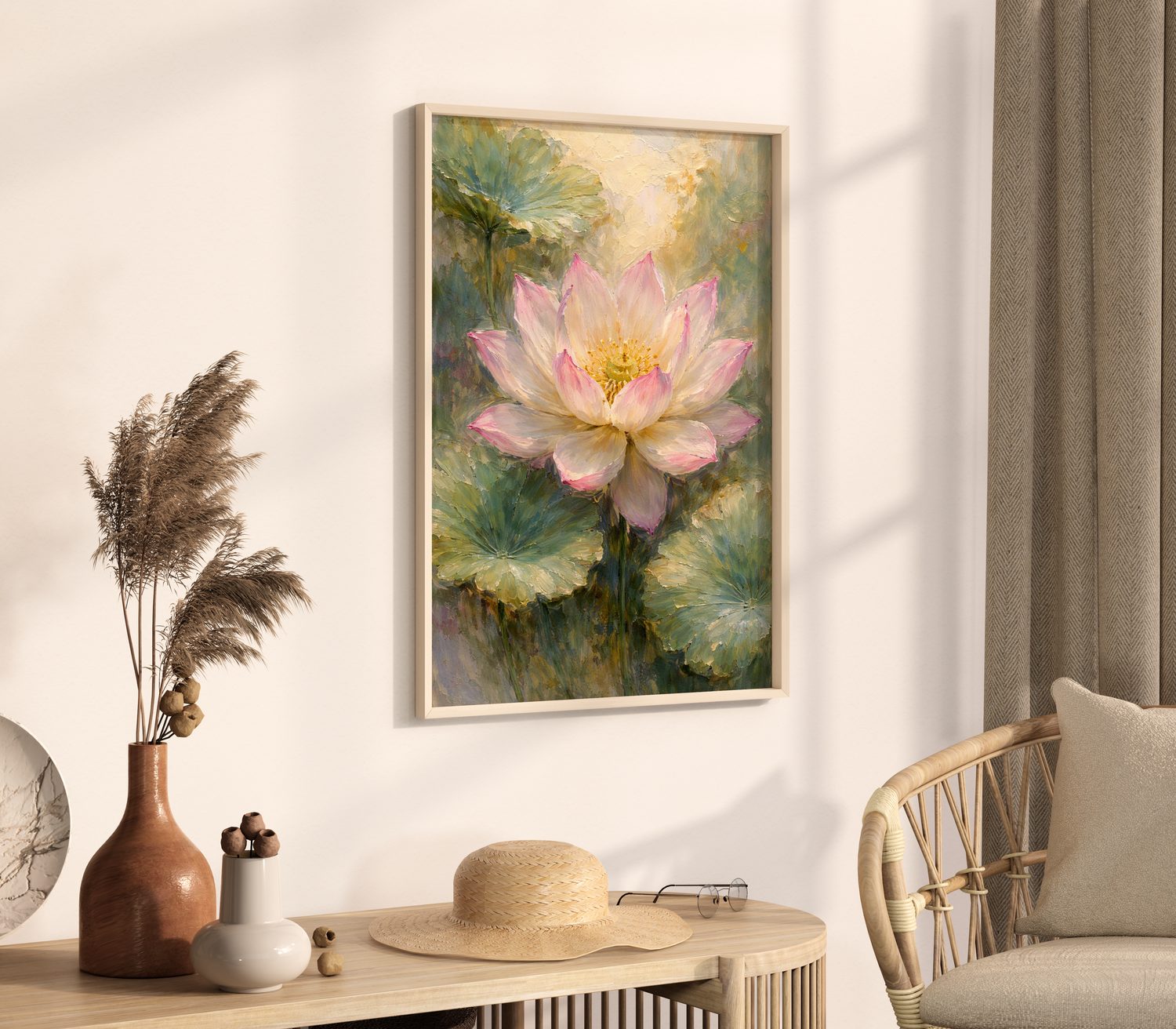
View Lotus Flower Canvas on Rustic Charm → from ₹1,899
The lotus is the highest-functioning piece of cultural colour psychology we sell. Pale-pink-on-cream, the colour palette is Western "calm" and Indian "purity-and-rising-above" simultaneously. In a bedroom it cools the room; on a meditation wall it earns its symbolic weight; in a foyer it greets guests with a piece of art that doesn't have to be explained.
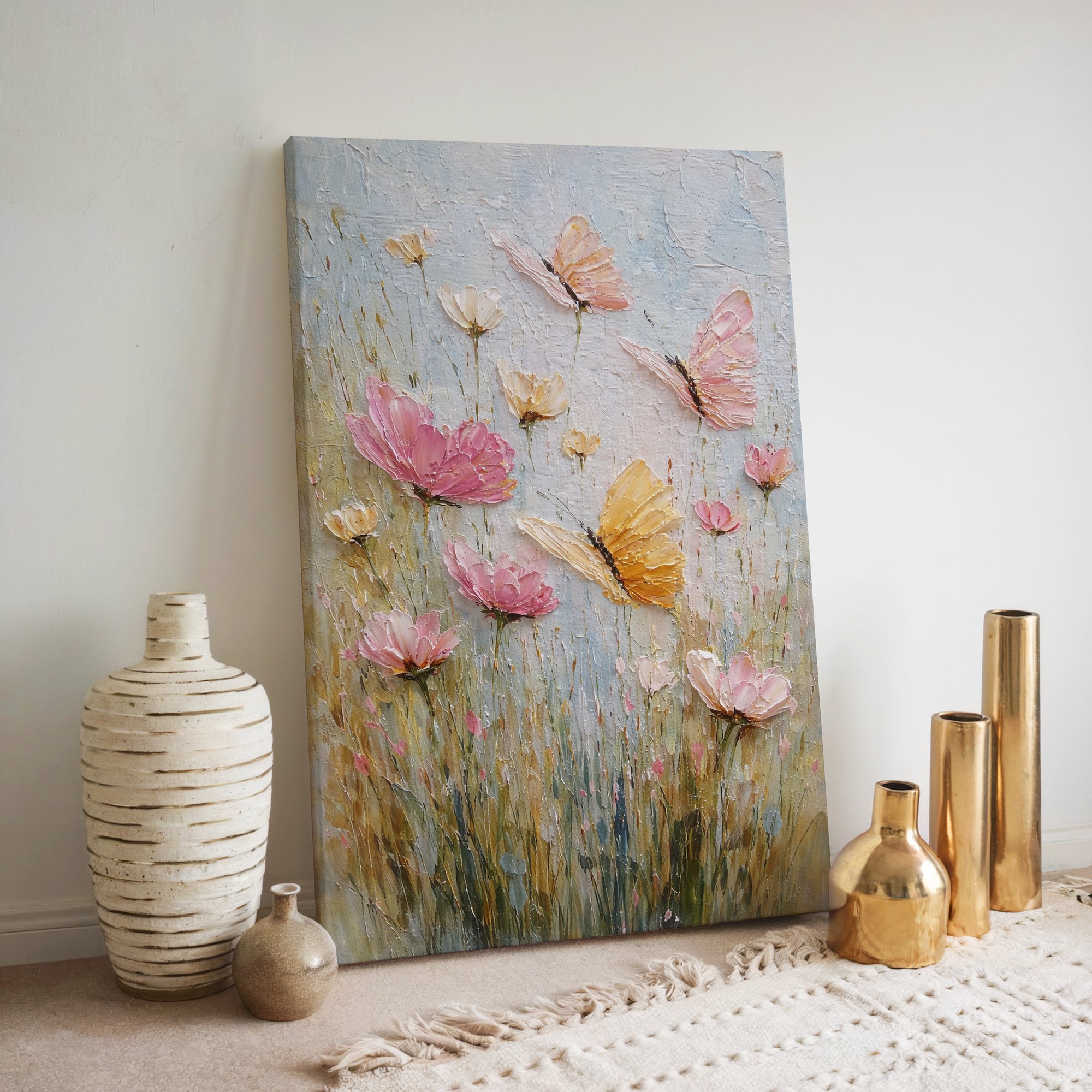
View Butterfly Flower Canvas on Rustic Charm → from ₹1,899
Butterflies are colour-flexible and culturally light — a textured, multi-coloured butterfly canvas painting is what you choose when you want playful warmth without needing a single dominant hue. For children's rooms, breakfast nooks, or any space where the dominant emotion is "this is a happy place", butterflies do the work without asking you to commit to red, yellow, blue or green.
A Note on Vocabulary — "Canvas Painting" vs "Canvas Print"
In India, "canvas painting" is the everyday term for what the global art industry calls a giclée canvas print — an ultra-high-resolution reproduction of an original artwork, printed with archival inks onto 300 GSM cotton canvas, then hand-stretched on a wooden frame. Unlike a hand-painted original (which ranges ₹50,000+ for a comparable size), a giclée canvas print delivers the same visual impact at D2C prices, with superior longevity and consistency. We use both terms in this guide because they refer to the same thing, depending on whether you are a designer or a customer searching Google.
We also do not sell AI-generated wall art. We see the question often — "is this painting made by an AI?" — and we want it on the record. Every piece in the Rustic Charm catalogue is sourced from original artwork or photography, then reproduced via giclée. There are no Midjourney prompts, no Stable Diffusion outputs, and no "made by a model" canvases on our website. In a market quietly being flooded with AI floral and abstract knockoffs, that distinction has become a colour-psychology point in its own right: the authenticity of an artwork affects how it reads on your wall over time.
Don't Fight the Wall — Match Art to What's Already There
The single biggest mistake first-time art buyers make is choosing a canvas in isolation. Colour psychology only works in context — your wall colour, your sofa, your floor, your light. A pale-blue print floats invisibly on a pale-blue wall; a warm orange canvas turns muddy on a deep mustard wall; a high-contrast black-and-white set looks dirty against a beige with too much pink in it.
Three short rules that solve 80% of these problems:
1. The 30% rule. Pick a wall art piece whose dominant colour is already present in the room — but at a 30% larger or smaller scale than where it appears elsewhere. If your sofa cushions are dusty rose, a peony canvas with rose at the centre repeats the colour with confidence. If your rug has small green motifs, a meadow canvas dominated by green completes the conversation.
2. The temperature match. Cool walls (north-facing, fluorescent-lit, or painted in cool greys/blues) take cool art best. Warm walls (south- or west-facing, painted in warm whites, beiges, terracottas) take warm art best. Mixing temperatures works only when the print is genuinely neutral — black-and-white, taupe-and-cream — not when it is, say, blue art on a peach wall.
3. The "step back" test. Before buying, mock up the colour fit by holding a printout (any size) on the wall and stepping back six feet. The colour psychology question to ask is not "do I love this print?" — it is "does the room get calmer or louder when I imagine it on the wall, and is that what I want?"
Decision Framework — Picking the Colour for Your Space
Use this as a one-page checklist. Most rooms in an Indian home will fall cleanly into one of these answers.
Bedroom (sleep priority): Cool tones. Lavender, soft pink, muted green, white-on-cream. Avoid: high-saturation reds, oranges, or AI-fluorescent abstracts.
Bedroom (mood-and-romance priority): Warm soft tones. Dusty rose, warm cream, soft pink florals. Avoid: greys, deep blues, anything black-and-white.
Living room (formal hosting): Warm soft tones or sophisticated neutrals. Peonies, roses, dusty pink florals; alternatively, cream-on-taupe minimalist sets. Avoid: bright yellows, kitsch pop, heavy black-and-white prints.
Living room (casual family): Mid-saturation warm or earthy boho. Mediterranean lemon, ethnic boho, warm florals. Avoid: stark cool minimalism that signals "showroom" rather than "home."
Home office or study: High-contrast black and white, or low-saturation neutral abstracts. Bold colour belongs near the door, not behind your screen. Avoid: any high-saturation warm hue directly in your peripheral vision while working.
Kitchen or breakfast nook: Warm yellows and citrus tones, or warm florals. Energy and appetite live here. Avoid: cool blues, which suppress appetite (a real, documented effect — see restaurant interiors review, Cornell, 2010).
Hallway or foyer: Bold, high-energy, statement piece. You walk past it. Habituation is a feature, not a bug. Avoid: anything calm enough that guests don't notice it.
Pooja room or meditation corner: Cool calming tones with cultural resonance. Lotus, soft blue, soft white. Avoid: anything that draws attention away from the practice.
Ready to bring colour psychology home?
Browse our Floral Wall Art collection for warm-tone florals that lift living rooms, our Abstract Wall Art collection for bold or balanced colour fields, and our Minimalist Wall Art collection for the quiet neutral palette every focused room needs — all giclée canvas prints hand-stretched on 300 GSM acid-free cotton, delivered across India.
FAQ
Does the colour of wall art actually affect mood?
Yes, in measurable but modest ways. Multiple studies on visual environments and self-reported mood (notably Küller et al., 2006) show colour saturation and warmth in a room shift alertness, calm and perceived comfort by 5–15% — enough to feel, not enough to override sleep, lighting or temperature. The colour of your wall art is one input among many, but it is the easiest input to change.
What colour wall art is best for a bedroom?
Cool low-saturation tones: lavender, soft purple, muted green, dusty pink, white-on-cream. Avoid bright reds, oranges and high-contrast black-and-white if sleep is the priority. The single most reliable bedroom palette in our experience is muted purple-on-cream, which reads as restful in both Indian and Western mood research.
What colour wall art works for a living room?
For a hosting-first living room, warm soft tones — peonies, roses, dusty pink florals — finish the room emotionally. For a quieter, modern living room, pair neutral minimalist sets with one accent of warm wood or brass. Avoid bright fluorescent abstracts; they fatigue fast in a room you spend hours in daily.
Are dark canvas paintings depressing?
Not inherently. Dark canvas paintings (deep blues, charcoals, blacks) read as sophisticated and grounding in well-lit rooms with at least one warm-light source. The "depressing" effect shows up only when a dark painting is hung in an already-dark room (north-facing, low ceiling, cool overhead light). Lighting solves 90% of the problem; the print is rarely the issue.
Does wall colour affect mood more than wall art colour?
Yes — wall paint covers far more visual area than any single canvas, so it sets the dominant tone. Treat wall art colour as a modifier, not the primary colour decision. If your wall paint is wrong for the mood you want, no canvas painting will rescue it; if your wall paint is right, the right canvas will reinforce it.
What's the safest colour to choose for a wall art gift?
Soft warm tones with low saturation — peony pink, dusty rose, cream florals, muted impressionist landscapes. These work in 80% of Indian homes regardless of existing decor, age of recipient, or room intended. Avoid bright reds, vivid yellows, deep blacks, or strongly cultural symbols when you don't know the recipient's tradition. A pink peony or a rose garden canvas painting is the floral equivalent of giving someone a thoughtfully chosen sari — safe, warm, and rarely wrong.
Is wall art colour psychology a real thing or just marketing?
It is real, but the effect is smaller than wellness blogs claim and bigger than sceptics claim. The peer-reviewed literature on environmental colour and mood is consistent across decades — colour shifts arousal, alertness and emotional response in modest, measurable ways. Marketing inflates "calming green" into "this colour cures anxiety." The truth is cleaner: cool greens make a room feel calmer; that is real; it is not a substitute for therapy, sleep, or sunlight.
Photography and editorial: Rustic Charm Team. All canvas paintings featured are giclée prints on 300 GSM acid-free cotton canvas, hand-stretched in India. Colour-psychology research drawn from peer-reviewed studies in environmental psychology and design — links inline. We do not sell AI-generated wall art.